Oswicks is another great example of a client that is more like 3 businesses in one. We spent a long time planning the best strategy to move them to the next level. In all of the services they offer they are up against strong competition.
Thankfully they understood that branding and identity would play a critical role in presenting them at the level which they were capable of operating at.
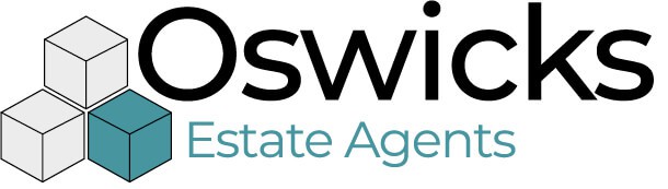
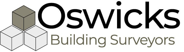
Their overall banner is �Property Professionals�. They offer services and consultancy all based around building.
We chose building blocks or 3 sided cubes that tesselate as a concept to work with. Each of the 3 separate disciplines or departments has to stand alone and be its own business. But in some instances, when there is an advantage to selling the company�s services as a whole, �Property Professionals� becomes the overarching brand.
They are equally strong individually and they also fit together as a seamless set.

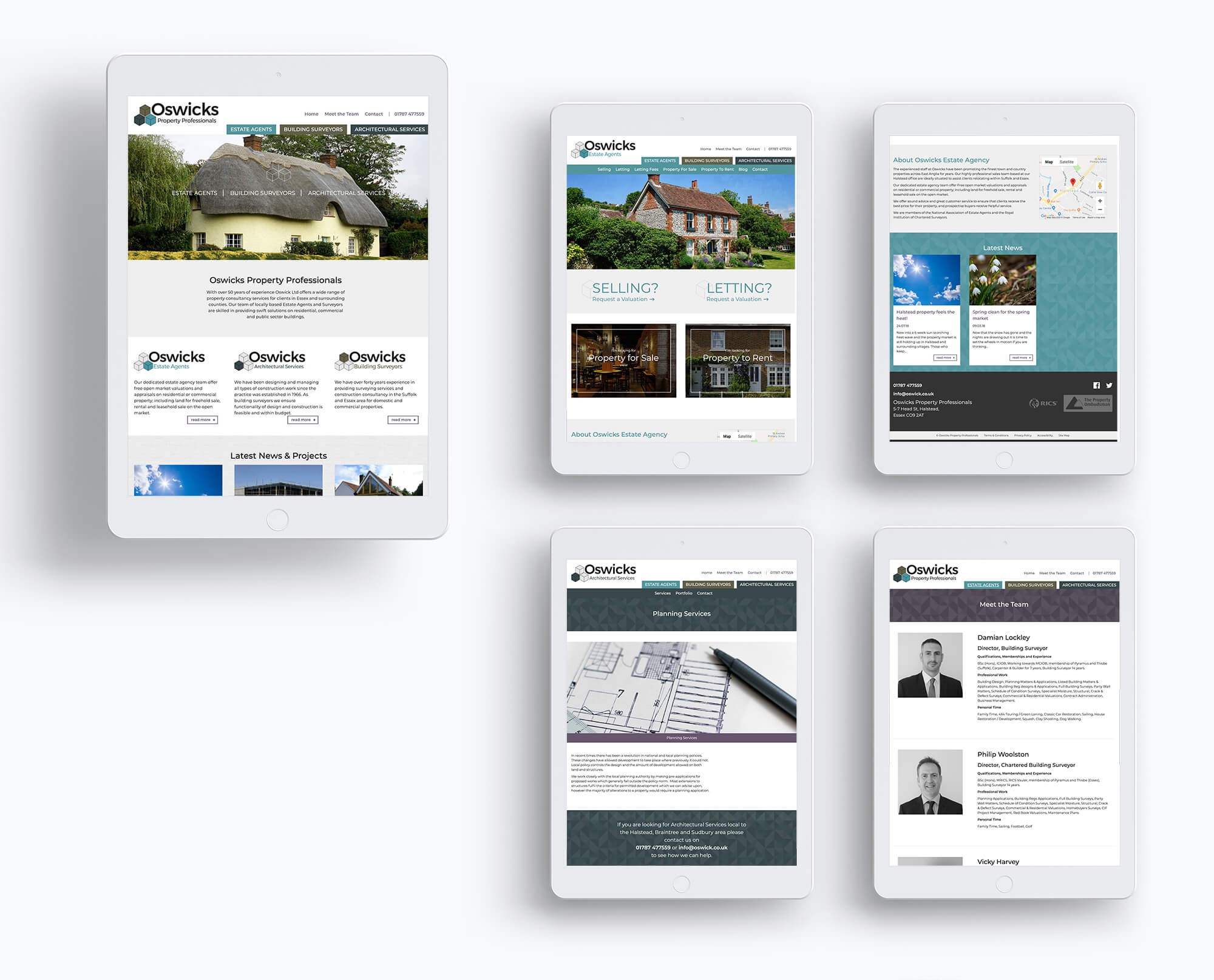
The idea of an umbrella brand, and the individual disciplines, needed to also be reflected in the website.
The structure is designed to accommodate the overarching business, as well as provide 3 micro sites that represent each of the departments. It�s important that the user gets to the discipline they are looking for and once they are there, they know where they are. Colour is used to great effect in this instance. Each discipline's colour is used enough to signpost but not be overpowering.
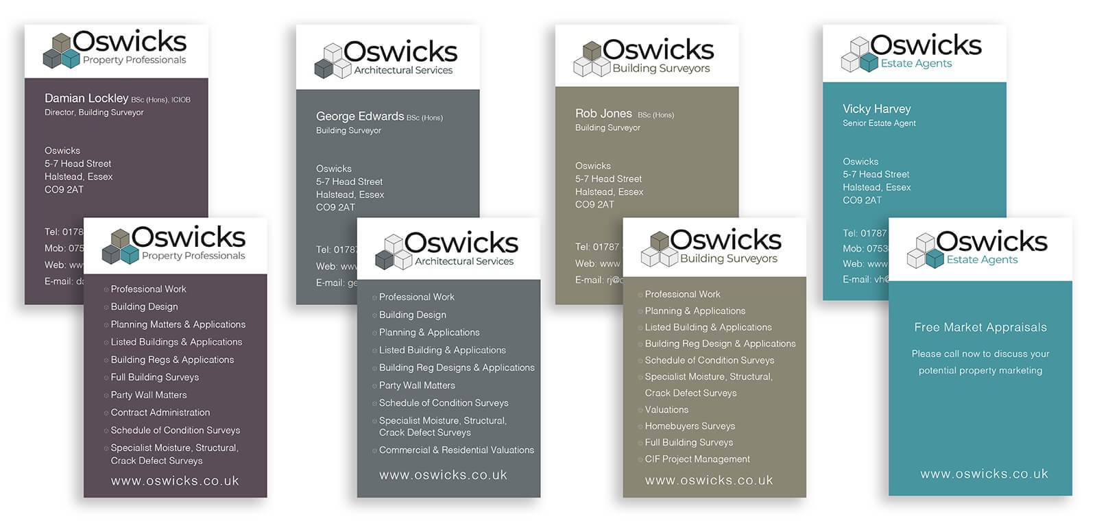
To make a rebrand work to its best potential, all visual elements of the business need to have the new identity applied.
We designed and produced an extensive range of stationery and because Oswicks have been really good at implementing the change it has strengthened the overall effectiveness of what we originally set out to achieve.
We also produced a large range of signage required to push the new identity through all areas where customers have touch points with the businesses.

Oswicks often attend shows so we were tasked with designing and producing a cost effective solution to tell the Oswick's Story. The eventual choice was a set of 22 portable vertical banners that could be grouped and presented accordingly.
Contact us today to schedule your free consultation and discover how we can help you grow your business.
Start your journey today